Maps with international education statistics
Maps are a powerful tool to visualize statistics. This site uses maps for cross-country comparisons of data like national primary school enrollment rates, shown in the map below.
Primary school net enrollment rate, 2002/2003
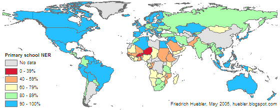
Data source: UNESCO Institute for Statistics (UIS). 2005. Global Education Digest 2005. Montreal: UIS.
Here is a list of articles on this site that include maps with international education statistics:
Friedrich Huebler, 5 February 2006 (edited 30 March 2006), Creative Commons License
Primary school net enrollment rate, 2002/2003

Data source: UNESCO Institute for Statistics (UIS). 2005. Global Education Digest 2005. Montreal: UIS.
Here is a list of articles on this site that include maps with international education statistics:
- Pre-primary school enrollment
- Primary school enrollment
- Gender disparity in primary school
- Secondary school enrollment
- Gender disparity in secondary school
- School life expectancy
- Primary completion rate
Friedrich Huebler, 5 February 2006 (edited 30 March 2006), Creative Commons License


Comments
Post a Comment